This week thedatabank launched an updated web site. Here are some key changes:
- A Learn section with white papers, guest articles, recorded webinars, and other resources for nonprofit organizations.
- A Connect section with many ways to engage, from social media to “in real life” events.
- The design has been streamlined to be easier to read, and convey the friendly personality of thedatabank.
Behind these changes are strategic efforts to increase the value of a relationship with thedatabank, step up to our growing role as thought leaders in nonprofit technology, make it easier for the search engines to find us, and connect with the nonprofit community through new channels.
What We Learned
This is the third redesign since I started at thedatabank in 2003, and the smoothest so far. Some keys to success:
- All of our staff pitched in to proofread, and catch problems right away.
- We cloned many key pages and worked on the content in parallel with the design process, so that as soon as the final design templates were approved, we were ready to make the switch.
- Before beginning, we thought strategically about the audiences for the site, how they were getting there, their objectives, and our objectives. Once we had consensus on this, it became much easier to decide which items received top billing on the home page and navigation.
- We nailed down messaging and branding prior to design and copy writing. Then we shared our internal Brand & Style Guide with the designer.
- We used analytics to identify problems, such as dead ends, and pages that were under-performing on conversions. For example, we found out “Contact Us” was one of the most viewed pages on our site, and a common Exit page – yet we had no lead collection device on that page.
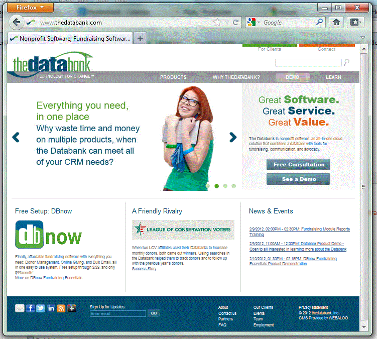
Just for fun, here’s what the web site looked like on the day I started working at thedatabank. Keep in mind, the world wide web was only around 3 years old when we launched this beauty!
thedatabank’s website in 2003
 thedatabank, gbc is technology for change, and we walk the talk.